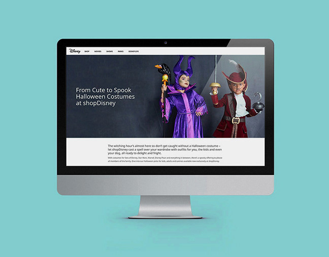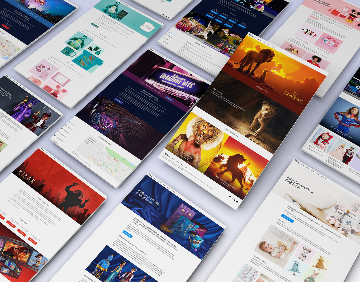
Web & UX Design
During my time at MDV, I redesigned the majority of their e-com site. This included UX improvements to the product page, collection pages, nav and search functionality.
Utilising my UX skills, as well as knowledge of user journeys, responsive design and accessibility, I updated various visual components and functionality from initial concepts through to final execution, working alongside a dev team to implement them. This resulted in significant improvements to conversion rate, session durations and site speed.
Utilising my UX skills, as well as knowledge of user journeys, responsive design and accessibility, I updated various visual components and functionality from initial concepts through to final execution, working alongside a dev team to implement them. This resulted in significant improvements to conversion rate, session durations and site speed.
Product Page
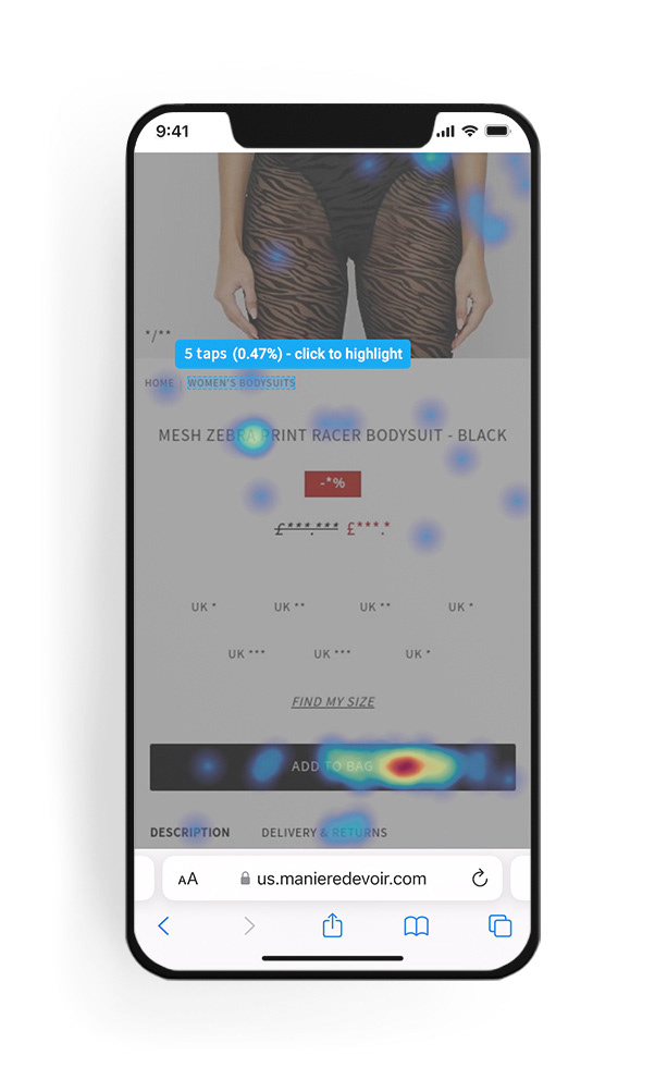
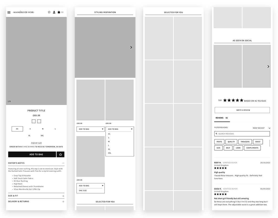
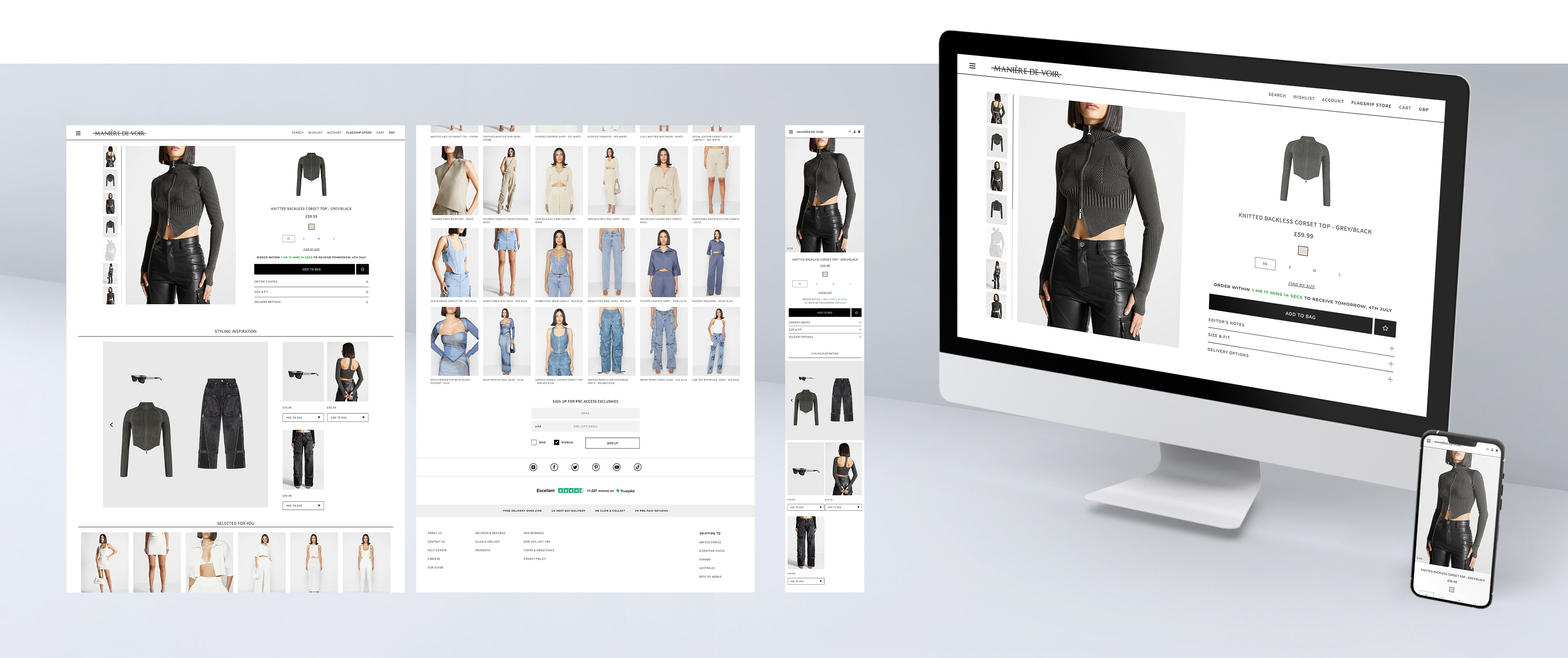
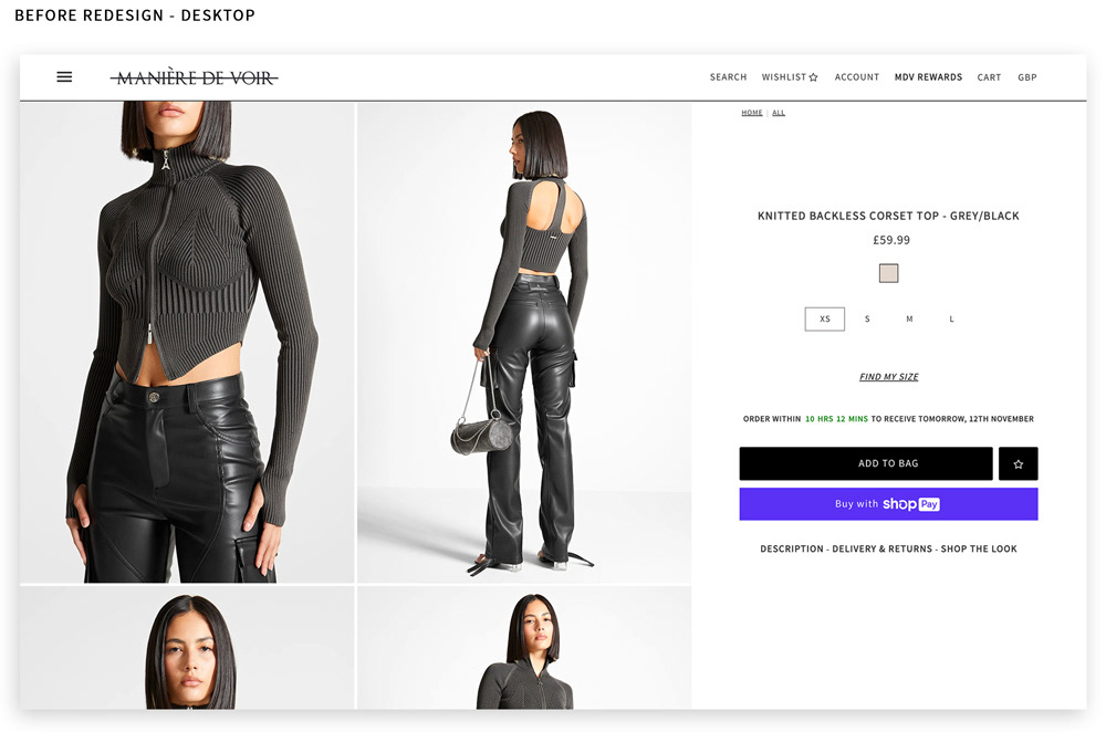
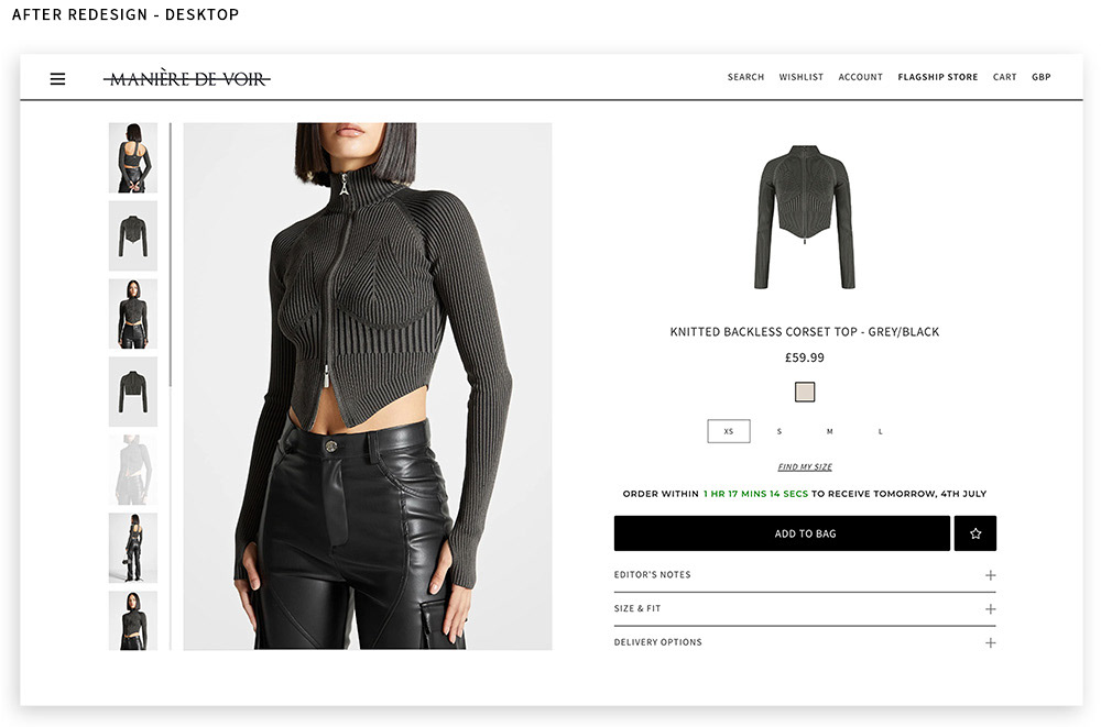
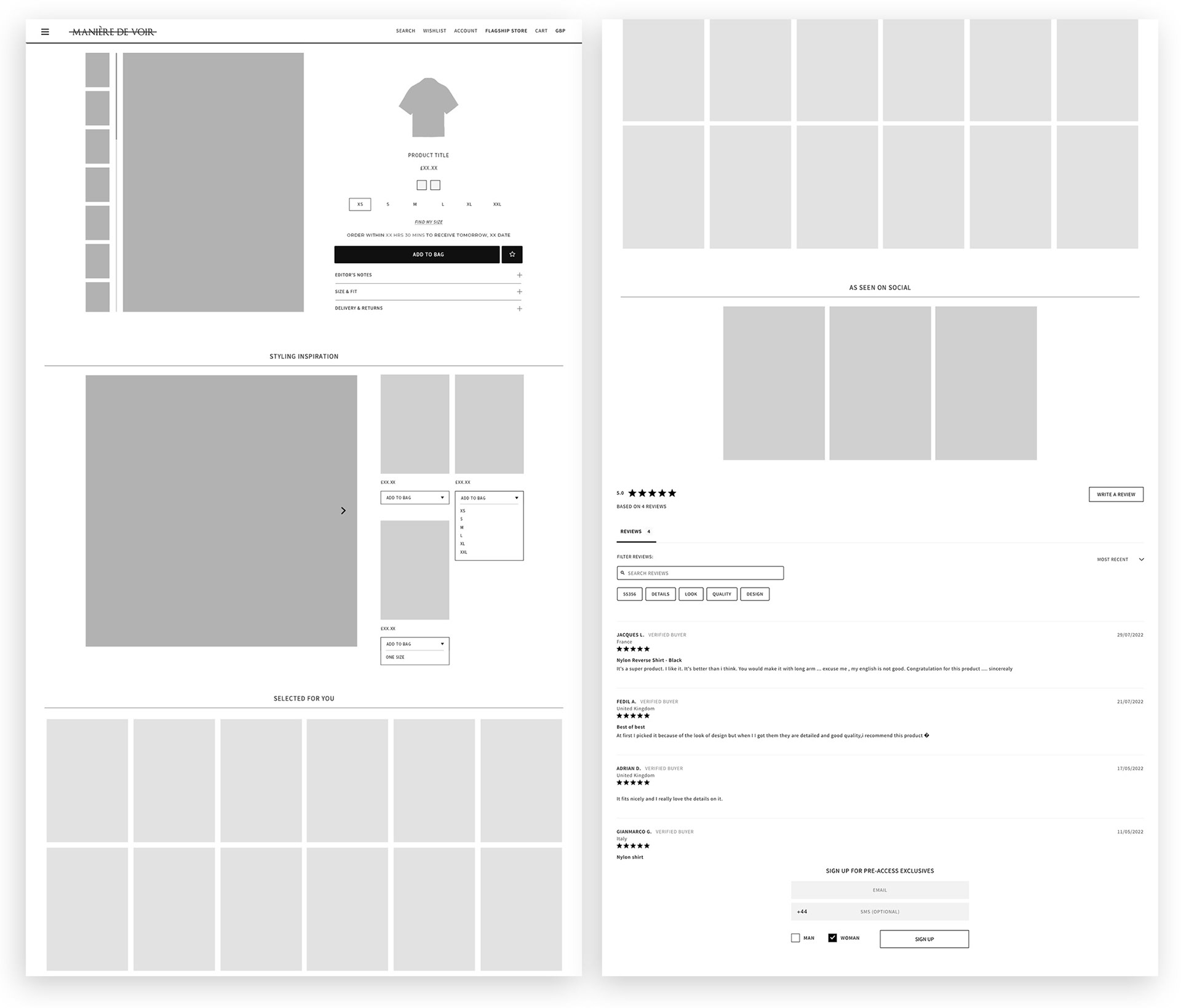
I oversaw significant changes to the product page design to improve the overall layout, flow and use of space. The desktop image gallery was redesigned to provide a more compact vertical sliding carousel, as well as introducing the product flatlay as a transparent image. I used heatmaps of the old site to identify under-used elements which could be removed which, combined with the new image gallery, improves the overall hierarchy and use of white space. The description, previously lengthy and displayed below the image gallery, was also split into multiple sections and is now displayed in a more user-friendly dropdown system.
I oversaw significant changes to the product page design to improve the overall layout, flow and use of space. The desktop image gallery was redesigned to provide a more compact vertical sliding carousel, as well as introducing the product flatlay as a transparent image. I used heatmaps of the old site to identify under-used elements which could be removed which, combined with the new image gallery, improves the overall hierarchy and use of white space. The description, previously lengthy and displayed below the image gallery, was also split into multiple sections and is now displayed in a more user-friendly dropdown system.
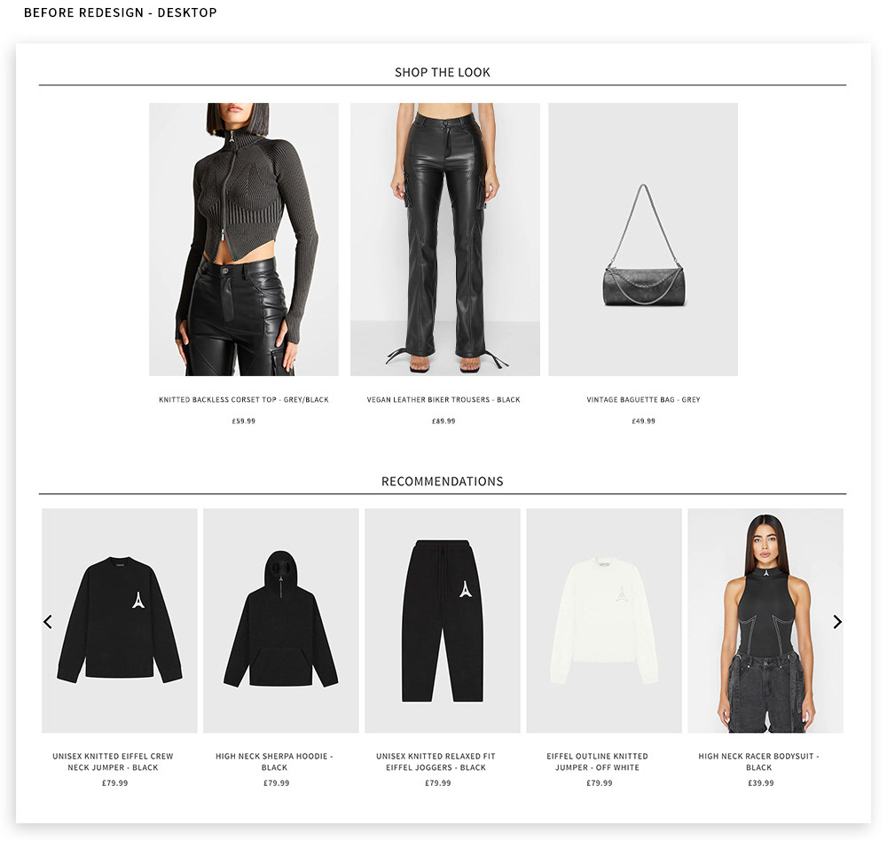
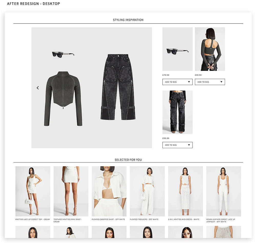
Further down the page I also worked to improve product cross-sell, replacing the old 'shop the look' section with a more engaging 'styling inspiration' module, showing a carousel of different outfit combinations. As well as adding variety to how products are displayed, this adds value to the customer by suggesting complimentary products and adds a second, efficient opportunity to add products to basket with just two clicks.
Process
Working to a limited budget, I used live data such as heatmaps and first-click testing to inform my decisions, as well as journey mapping and competitive analysis of other luxury e-com sites. The results included increased conversion rates, decreased bounce rate and increased session durations. During this, I also consolidated guidelines around font usage and sizing, colours and UI elements to improve the overall consistency and accessibility of the site.
Working to a limited budget, I used live data such as heatmaps and first-click testing to inform my decisions, as well as journey mapping and competitive analysis of other luxury e-com sites. The results included increased conversion rates, decreased bounce rate and increased session durations. During this, I also consolidated guidelines around font usage and sizing, colours and UI elements to improve the overall consistency and accessibility of the site.